DataBasic
Teaching data literacy with simple browser-based analysis tools

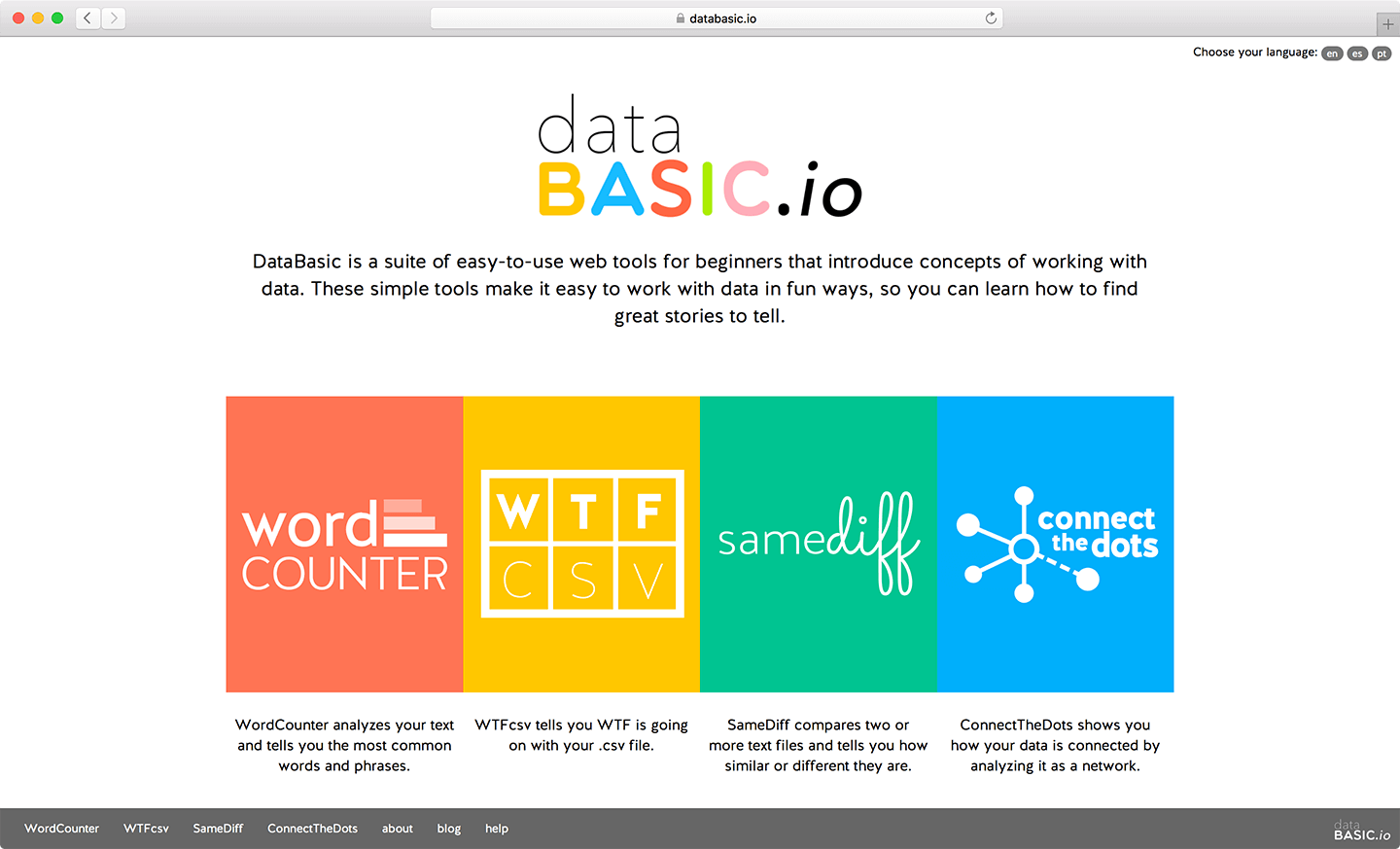
DataBasic is a suite of web tools designed to introduce beginners to basic concepts and techniques in data analysis. A joint project between the Engagement Lab at Emerson College and the MIT Center for Civic Media, these tools were created with journalists, community groups, and students in mind. Despite the explosion of interest around big data and the increased availability of open data sets, many of these organizations don’t know where to start when it comes to trying to identify trends or find stories.

There’s a huge gap in the technical knowledge needed to make a graph in Excel and to do logistic regressions in R. DataBasic seeks to bridge that divide by exposing users to more sophisticated data analysis with no coding necessary. The tools are designed specifically for learning, from sample data sets to glossary definitions and even activity guides to help educators use DataBasic in classrooms or workshops. Accessibility was also one of the primary design goals — the app is screen-reader friendly and has been translated in both Spanish and Portuguese, with more languages on the way.
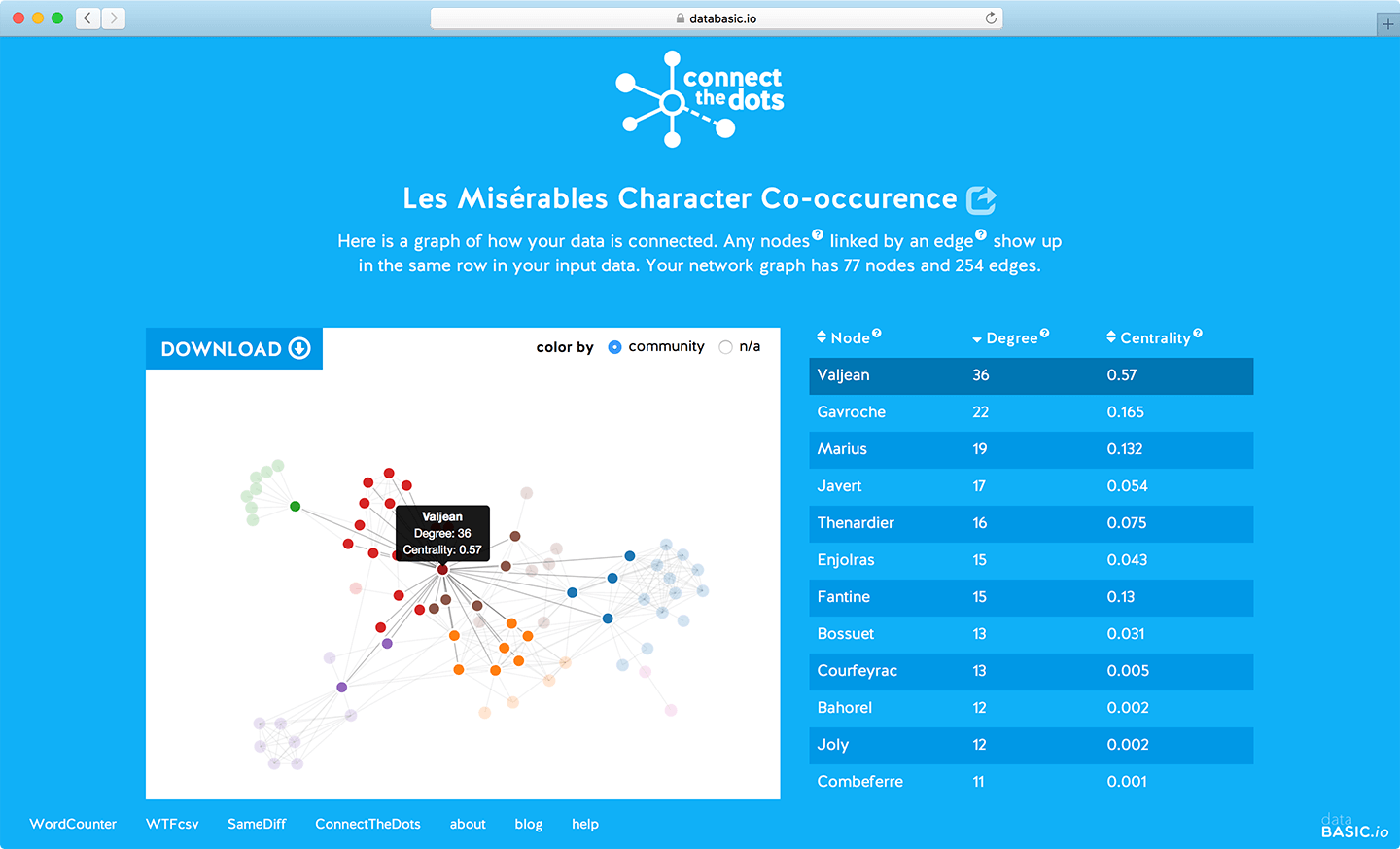
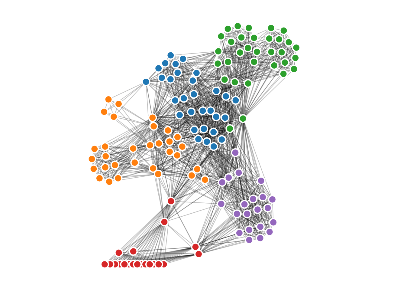
In order to keep things as simple as possible, each tool does one thing and does it well: WordCounter is for frequency analysis, WTFcsv gives a high-level overview of a dataset, and SameDiff compares two documents. I was brought on the team as a developer to build a fourth tool, ConnectTheDots, which helps users visualize and analyze network data. The tool takes a list of edges — connections in a network — and turns that information into a network graph. This lets users see the relationships in the data set and identify the most central nodes in the network.

On the back-end, ConnectTheDots (and all of DataBasic) is built on top of the Python Flask framework. Users can either upload a CSV file, paste in rows from a spreadsheet, or use one of the provided sample data sets. This user-inputted data is then validated and converted to a graph format, thanks to the NetworkX module. In addition, the app also runs some basic analysis of the data: it calculates metrics like betweenness centrality — which measures how centrally-connected each node is (Kevin Bacon might have a high centrality) — and identifies sub-communities within the network.

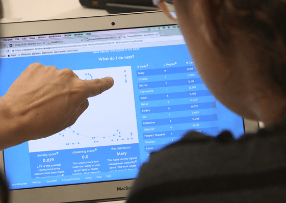
This information is passed to the front-end, where it is rendered as a D3.js interactive graphic, allowing users to inspect and play with the network. Presented alongside this is a sortable table of all the nodes, which makes it even more clear how the data itself maps to the visualization. This is also followed by a “what next?” section, which highlights key facts and raises questions about the network in order to get users to think critically about the data. Finally, the graph can be exported in a variety of formats: PNG/SVG for sharing and printing, or GEXF for further analysis with Gephi.

Stephen Suen
I'm a designer and developer with a passion for data-driven storytelling and human-centered products on the web.
Follow