Chartisan
Farm to table to chart, with React and D3.js

Chartisan started off as a weekend hack project to learn Webpack but quickly snowballed into a full-fledged, browser-based charting tool. From a technical perspective, it is my first major project built on the modern JavaScript ES6/Babel/React web stack, and combines the power of D3’s visualization utilities with React’s componetization and data bindings. In simpler terms, I rolled my own “artisanal” version of Quartz’s Chartbuilder with a distinct design language and opinionated defaults. Visually, Chartisan takes influence from the charts of FiveThirtyEight and the Python library leather, implemented via the Tachyons CSS framework and PreCSS/PostCSS.
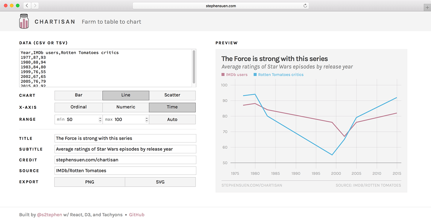
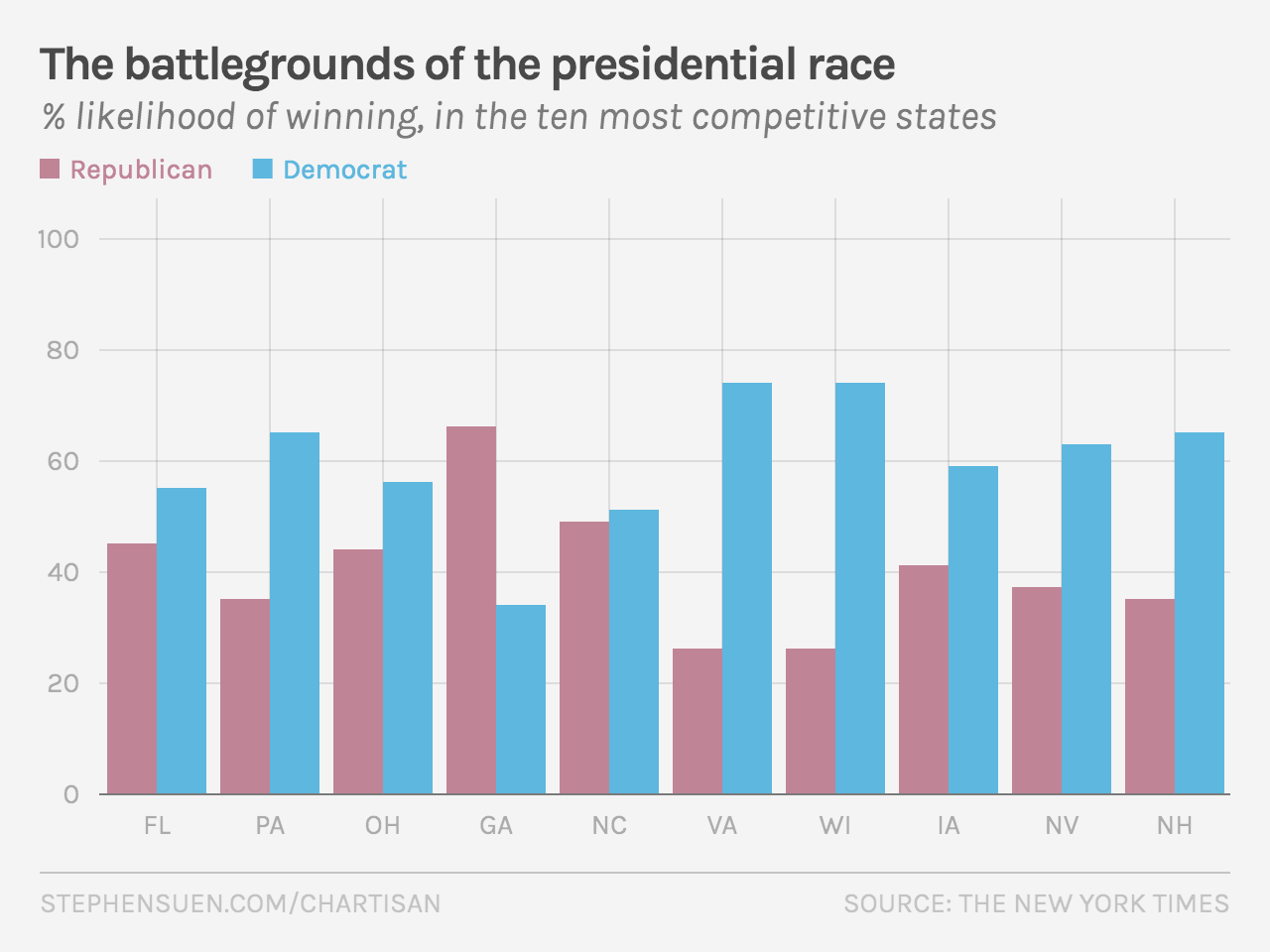
Chartisan takes a CSV or TSV dataset, parses the data, and draws it on a graph as either a bar chart, line chart, or scatterplot. The tool can handle ordinal/categorical, numerical, and time data (using Moment.js for parsing); it also supports multiple series on the same scale. D3’s scale/axis modules then automatically suggest bounds to best show the graph’s domain and range, but users can fine-tune these values accordingly — if, for example, they staunchly believe that the y-axis should always start at zero.

Thanks to React, changes happen in the browser in real-time with no need for a page refresh or server request. This allows users to freely modify their chart on the fly and visually verify throughout the design process. Once the user is happy with it, they can add additional labels for context (e.g. title, subtitle, data source). Finally, these charts can be exported as static PNG images to be embedded in articles or shared on social media. Alternatively, they can be exported as SVG files for further editing in a separate vector image program like Illustrator or Sketch.

Stephen Suen
I'm a designer and developer with a passion for data-driven storytelling and human-centered products on the web.
Follow