Welcome to v3.0
Under the hood of my new (new) website

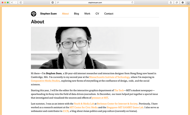
Old websites are the time capsules of the internet age. Instead of capturing the moment in the form of random trinkets and baubles, they freeze time via dated design patterns and <marquee> tags. Like their physical counterparts, they can store embarrassing photos or now-awkward pieces of writing. But an old website is not deliberately buried under inches of dirt in the backyard — there’s nothing to explictly signify that it’s out of date. Someone can find it in the wild and take what’s on it at face value.

Until today, I was still 20 years old and in my second year of MIT — according to my website, at least. For two years my portfolio gathered dust. Even as I was going through college acquiring new skills and working on new projects, none of that was being reflected anywhere online besides in the transient stream of social media. Graduating from MIT finally gave me the push, the time, and yes — the need — to correct that.
Back-end: Jekyll + GitHub
With this post, I welcome you to the latest and greatest incarnation of my personal website and portfolio. This is actually the third version of the site, with one version that didn’t even make it out of development. Besides the obvious visual redesign and updates in content, the biggest change was moving from Wordpress to Jekyll, a lightweight static site generator that renders Markdown into custom layouts, like the one you’re seeing now for blog posts. This time around, I wanted to make blogging an even more frictionless process for myself. If we really want to talk about distraction-free writing, Markdown is about as simple as it gets.
I am hosting everything via GitHub Pages — not because I need the version control or because I want people to submit pull requests — but because I want the discipline that Git has taught me in software development (iterative, modular updates) to carry over to my content production as well. To be fair, my contributor graph hasn’t been all that great lately, but you can’t really compare with two years of no website updates. Ideally, this website should reflect the latest version of myself — in my work, my thoughts, and my abilities.

Front-end/Design
On the front-end, this website is actually pretty simple — just a few Liquid templates and partials, backed by thoughtbot’s Bourbon/Neat libraries, and a whole lot of Sass. I used Robert Vinluan’s portfolio as a model for the basic site structure. On the type side, I’ve replaced FF Dagny and Tisa with Karla and Freight Text. Fonts are now much larger and whitespace has been increased for improved readability, especially on mobile devices.
More work still has to be done in terms of browser support and graceful degradation, but I wanted to get this out of the door first before going too deep into that rabbit hole. Other items on the to-do list include bringing back the Grantland-style margin notes and creating animations or interactive elements for the home page. Eventually, I’d love to do fancy, custom-designed longform essays in the style of Frank Chimero or Trent Walton, but that’s a discussion for after I establish a regular blogging cadence.
What’s next
With the launch of this website, I’m officially kicking off my job search in a more serious capacity. I’m applying for full-time roles at a variety of companies in design, tech, and journalism. If you’re hiring or know of any open positions that might be a good fit for me, please let me know on Twitter or via email. In the meantime, I’ll also be revisiting some unfinished projects — be sure to check this space often for updates. I won’t promise any specific blogging schedule, but I can say that it will be slightly more frequent than once a year. There’s nowhere to go but up.

Stephen Suen
I'm a designer and developer with a passion for data-driven storytelling and human-centered products on the web.
Follow