The Tech
The first newspaper on the web, rebuilt for the modern web

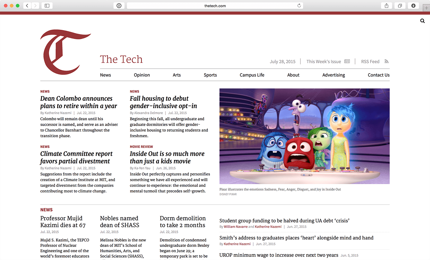
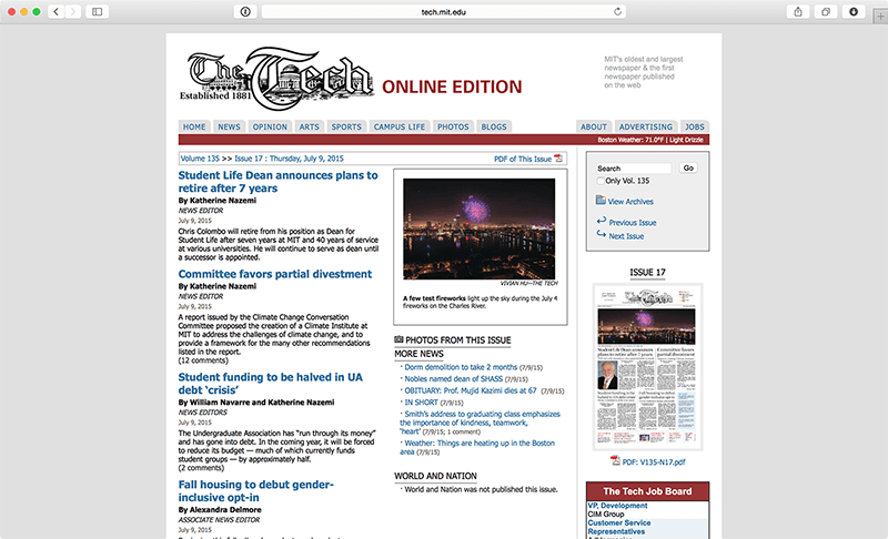
The Tech is MIT’s student newspaper and the first newspaper to be published on the web. Prior to our redesign, the last time the website had been updated was in 2007. Naturally, web standards and design practices have advanced significantly since then, and the ubiquity of mobile devices means that responsive design is a necessity. The Tech’s online presence was long overdue for a massive overhaul, both in its visual design and underlying content management system.

The Tech’s old website was built on a custom PHP CMS over the course of generations of previous MIT students; it interfaced with Adobe Creative Suite and our publishing system via an assemblage of old Perl scripts. Updating web content outside of our regular print schedule was a non-trivial process that required editors to physically come into The Tech office, and our outdated technology stack was making it difficult to recruit new staffers to work on our codebase.
To address these issues, we formed a dedicated web design team with the goal of creating a brand new platform, liberated from the constraints of our print product. We needed a browser-accessible CMS — so that we could update it from anywhere — and a responsively designed website — so that people could read it from anywhere. At the same time, it had to remain compatible with all our existing back-end systems and years of legacy content. Through this redesign, we were pushing the The Tech forward to become a digital-first newsroom.

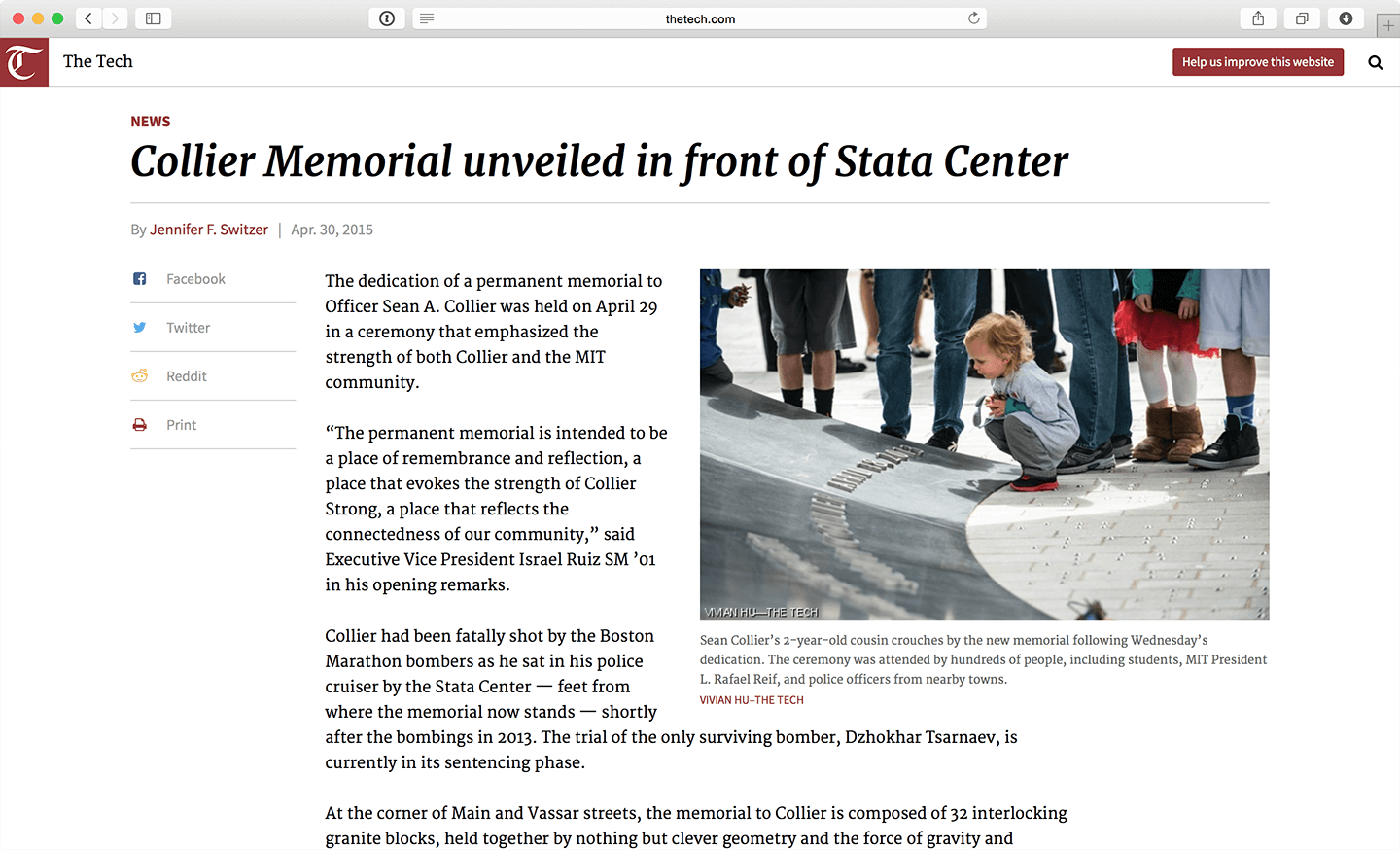
On this project, I served as the lead designer and front-end developer, planning the site architecture, creating wireframes and mockups in Sketch, and implementing most of the page templates. As one of the few members on the development team who also had editorial experience, I had to advocate for certain features and design decisions, inspired by my time at ProPublica and informed by industry best practices.
From an aesthetic standpoint, I sought to emphasize readable typographic systems supplemented by large photos and inline contextual content, all optimized for mobile devices. In addition, I designed the home page to better evoke the front page of a newspaper. On the back-end, this is powered a feature that allows editors to organize stories and photos to intentionally design the fold, as we do in our print edition.
The redesign has since been launched in an open beta for early adopters — in parallel with our old site — and will continue to undergo active development in conjunction with the needs of The Tech’s evolving editorial workflow. Our hope is that within the next year, the website will be ready for a full migration and the organization can embrace a truly digital-first publishing model.

Stephen Suen
I'm a designer and developer with a passion for data-driven storytelling and human-centered products on the web.
Follow